Queens Historical Society
Exhibition Panels
Print & Digital Exhibition Panels
Designed both print and digital exhibition panels. Some exhibits were created exclusively for the website during the pandemic. Others were created for both print and web.
Virtual Exhibits
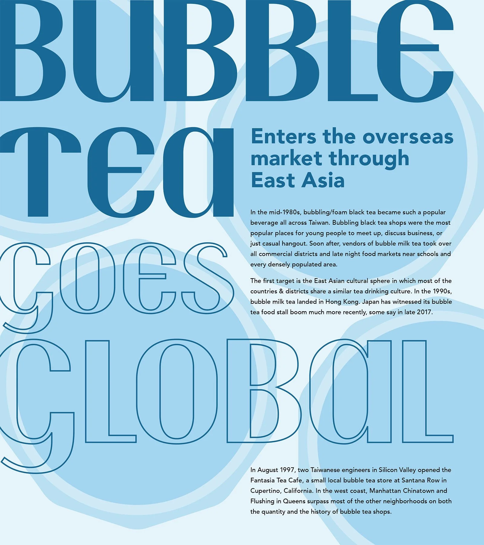
The Boom of Bubble Tea Drink Culture in Queens exhibition shows the rise in popularity of Bubble Tea / Boba. The headline typeface was chosen because of its unique curves, especially on the “T” which curves over like the plastic covers on the cups. The headline is designed to be read as a whole (both solid and the outlined words) or as the beginning of the subheading (only the solid words). The outlines were utilized to maximize the viewing of the background illustrations (bubbles, boba cup covers, a shop, and pillows), which represent the topic addressed in each panel. The illustrations were simplified to maximize the legibility of the text and complement the content of the panels.
*The panels were designed to also be print-compatible.
The Grace Lee Boggs exhibition was very text heavy and the curator wanted to include images of the activist so I made the panels taller. The size of all the headlines and text was kept consistent.
The McCoy Tyner exhibition headlines are in a modernized art deco typeface, Fino Sans. The curator wanted a typeface that resembled a 1920s Jazz Age image since the exhibition is on a Jazz musician.


Print Exhibits
Democracy in Action and Work and Play showcase Philip Guston’s mural Work and Play and its restoration. The panels had to be a specific size so I chose to flush “Democracy in Action” against the left, top corner and sized the subhead so “Philip Guston’s” is aligned to the cap height and ‘Work and Play’ is aligned to the baseline. In the second panel I had to fit three images and a large quote so I centered the headline, which subsequently prevented the panel from being too left heavy.
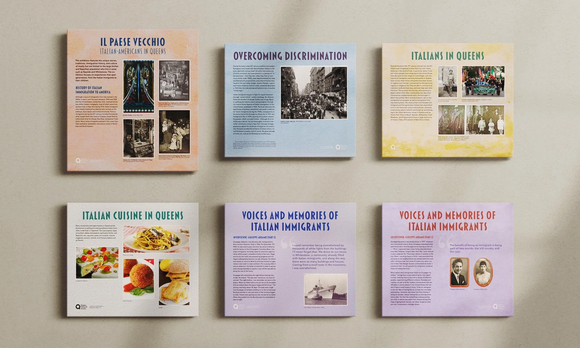
The Italians in Queens exhibition is a twelve panel print exhibition. The background textures and colors were inspired by the colorful homes in Burano, Venice, Italy. Two similar colors are placed next to each other if they are part one and two of an interview.
The headline and subhead font was chosen because the letterforms resemble pasta and fonts commonly used on Italian travel posters. Their colors were picked from all twelve backgrounds and were chosen from a monochromatic color scheme, with some colors adjusted in hue or saturation to create more contrast between the headlines and backgrounds.
The maps of Queens and Italy on the eleventh panel were illustrated to show where Italians immigrated from and where they settled in Queens. The panels were limited to two sizes, with one more vertical to fit more text.


