Lewis Latimer House Museum
Brand Identity
Brand Identity
Print & Digital Collateral
Worked on the rebrand of the Lewis Latimer House Museum and the creation of a responsive WordPress website. LLHM is geared toward fostering the interests and the education of youth in science and technology. Our main focus was on honoring Lewis Latimer, the African American inventor of the filament used in lightbulbs, and creating a fresh and modern identity.
Logo
Throughout our iterations we tried to pay homage to the filament by using curves and yellow / orange colors. The final logomark is in the shape of the Lewis Latimer house roof and the colors chosen represent the filament. The stacked name of the museum creates the body of the house.
-

Original Logo
-

Primary Logo
-

Black
-

Knockout
Print Collateral
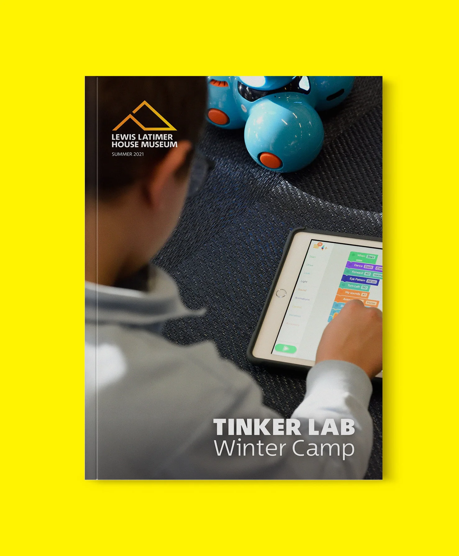
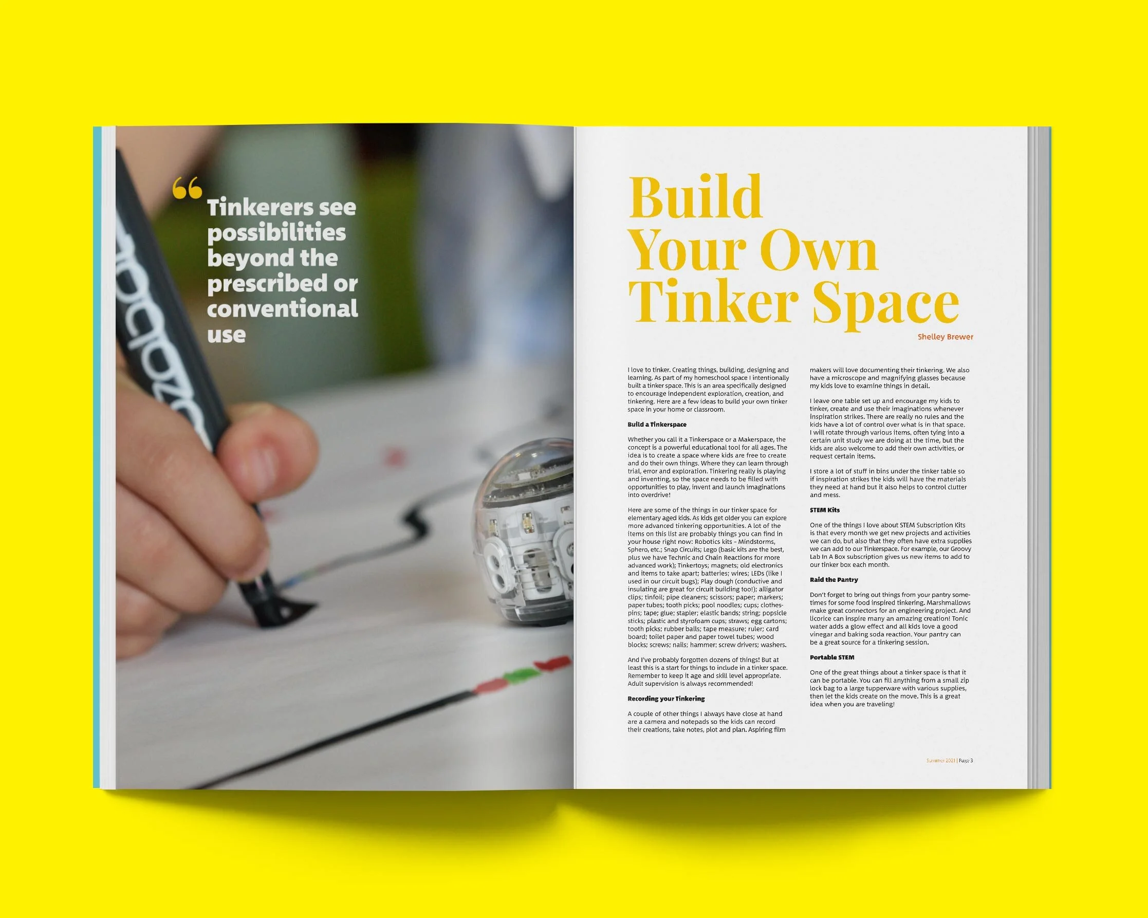
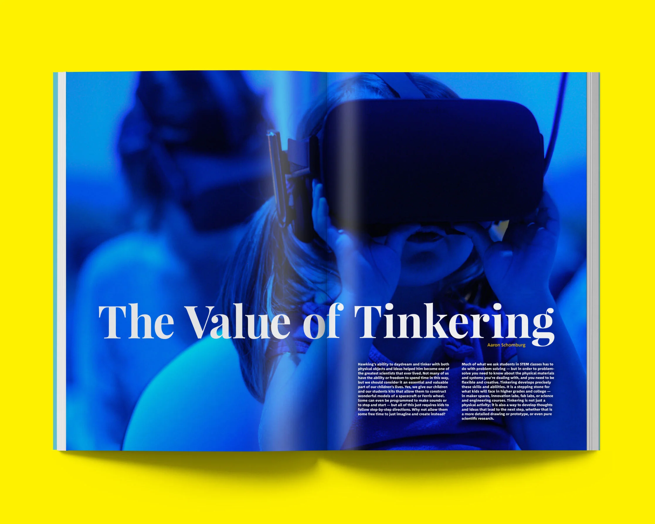
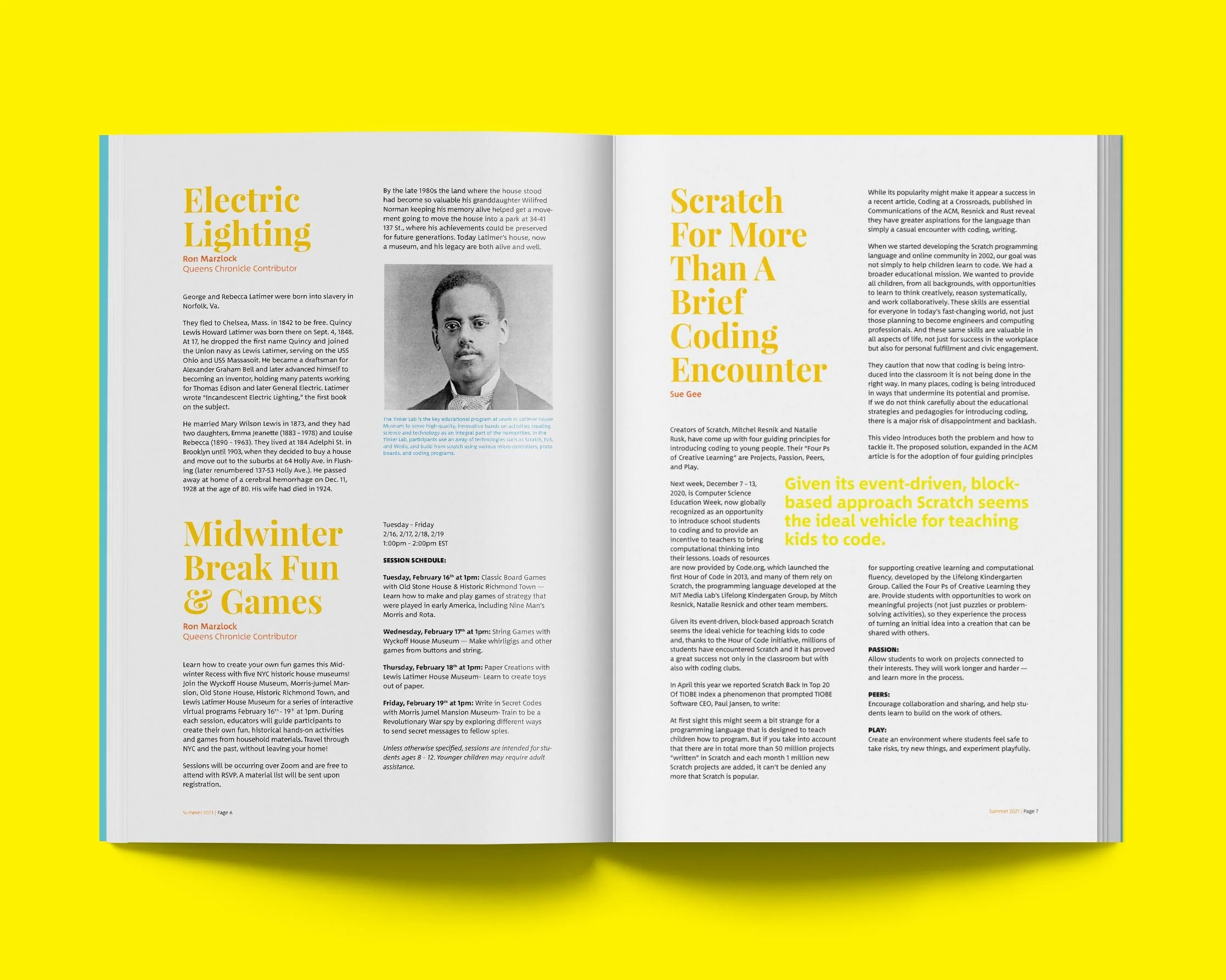
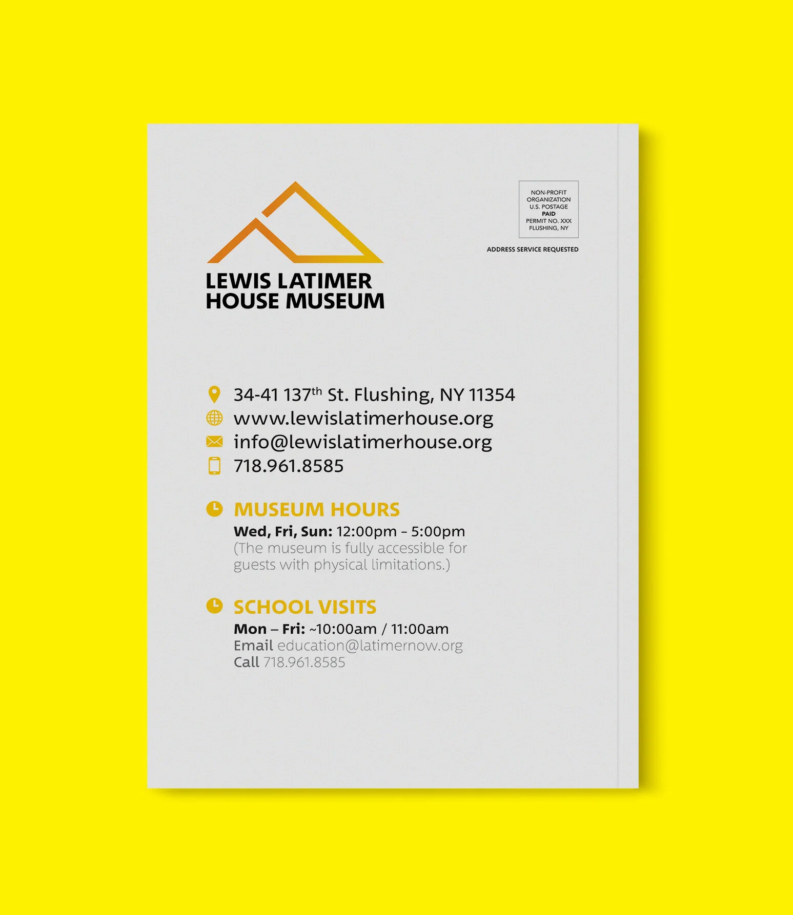
Designed business cards, letterhead, and a manual for the website. Created newsletter, postcard and MailChimp templates that can be used when LLHM gets a designer on staff.
Logo Exploration
Below are pictures taken at the Lewis Latimer House Museum of the filaments Lewis Latimer designed. We used these as inspiration for the shapes and curves of the logomark.
We experimented with house, roof and coil shaped logomarks. We preferred the “llhm” curved logomark because of the subtle use of the coil shapes. The stem of the “m” was created to be a design element, such as on a poster where it could extend down to a date or location. This logomark served as inspiration for the Tinker Lab logo, the location icon on the map and the Tinker Lab icons. LLHM chose the roof shaped logo as their official logo because it clearly indicates it is a house.
Logo Moodboard
Logomark Exploration
Color
The primary colors represent the colors in the filament of a lightbulb. The bright, vibrant yellows and blues were chosen to reflect and encourage the energy and creativity of the children attending classes and workshops hosted by LLHM. Yellow is associated with intellect as a nod to Lewis Latimer. It is also associated with energy, freshness and optimism which would serve the Tinker Lab initiative as it is youth focused. Orange is associated with change, freedom, encouragement. The tertiary blues were chosen to compliment the yellows, with both showing youthfulness in its brightness. The darker secondary and tertiary shades are used in special cases, such as the Tinker Lab’s landing page header image or in print collateral.
-

Primary
CMYK 0 20 100 0
RGB 255 203 5
HEX #FFCB05
-

Primary
CMYK 0 55 100 0
RGB 246 139 31
HEX #F68B1F
-

Secondary
CMYK 0 0 100 0
RGB 255 242 0
HEX #FFF200
-

Secondary
CMYK 0 75 100 0
RGB 242 101 34
HEX #F26522
-

Tertiary
CMYK 55 0 16 0
RGB 102 202 216
HEX #66CAD8
-

Tertiary
CMYK 65 15 0 0
RGB 68 173 226
HEX #44ADE2
-

Tertiary
CMYK 78 78 0 0
RGB 86 81 162
HEX #5651A2
Typography
Between 2 is a font developed by Akira Kobayashi, who is the type director at Monotype, and was created for brands that want a friendly touch. Between 2 is round and easy to read, a versatile font for both print and digital. It strikes a balance between crisp and highly legible on one hand and organic and friendly on the other. The “heavy” weight is used as the logotype to provide clarity, to contrast the logomark and to evoke the feeling of a modern museum logo.


