Harlem View
Logo & WP Website
Logo
WordPress Website
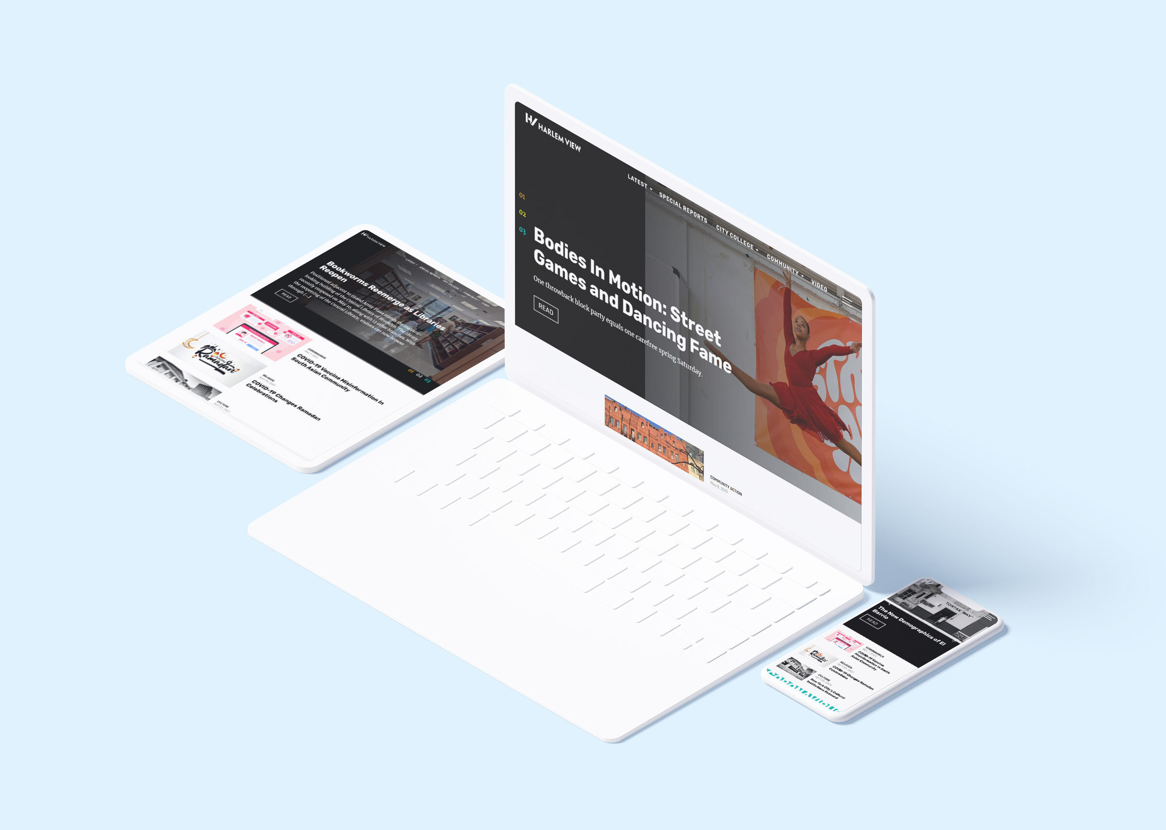
Redesigned the logo and built a responsive WordPress site for Harlem View (formerly Harlem Focus), a community-driven news platform. The goal was a modern, colorful design that remained clean and easy to navigate. An example provided to us was The Outline. The layout incorporates bold accents and clear structure to highlight stories and reflect the energy of the Harlem community.
Worked closely with the editorial team to align the visual identity with the publication’s new name and mission.
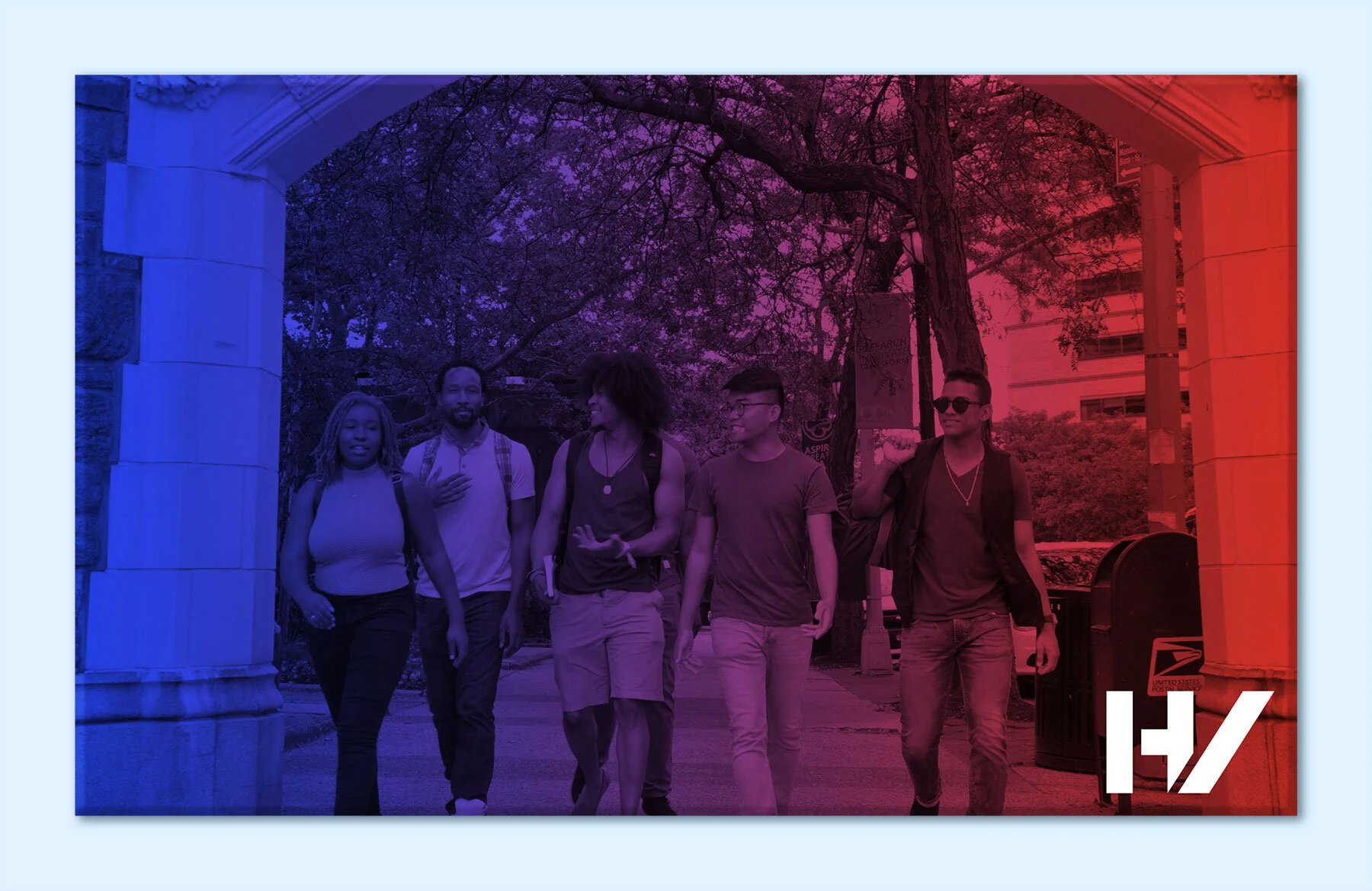
These are examples of how Harlem View can fully utilize these combinations for photographs and other branding materials.
Logo
With the rebrand from Harlem Focus to Harlem View, the new name reflects both the publication’s elevated physical location and its mission to offer fresh perspectives on local news.
The HV logomark draws inspiration from Harlem’s iconic apartment buildings, with the angled leg of the "V" casting a subtle 45° “shadow”. A thick sans serif font was chosen to convey a bold, urban feel. Black was selected as the primary logo color for its versatility across platforms and formats, based on research into contemporary news site branding.
-

Original Logo
-

Redesigned Logomark
-

Knockout Logomark
To support future use beyond the website, we provided a flexible logo system with multiple color combinations drawn from the official brand palette — ideal for print, social media, or other marketing materials. Provided are four examples of possible color combinations.
Logotype
Penumbra Sans is an all caps font designed by Lance Hidy in 1994. The Penumbra Sans’ semibold “H” closely resembles the “H” in the urban inspired logomark.
Layouts
We designed a flexible system of templates for Harlem View’s site including core pages like the homepage, Mission, and Contributors, as well as robust article templates. Article layouts feature multiple color themes — inspired by The Outline — and support a variety of content types: headers, videos, images, captions, sliders, pull quotes, tags, and related content modules.

Article Pages - Some Color Templates

Responsive Design

Desktop View of the Homepage, a Category Page & the Staff and Contact Page

A Series Section on the Homepage and the corresponding “Coronavirus” Series Page.
Manual
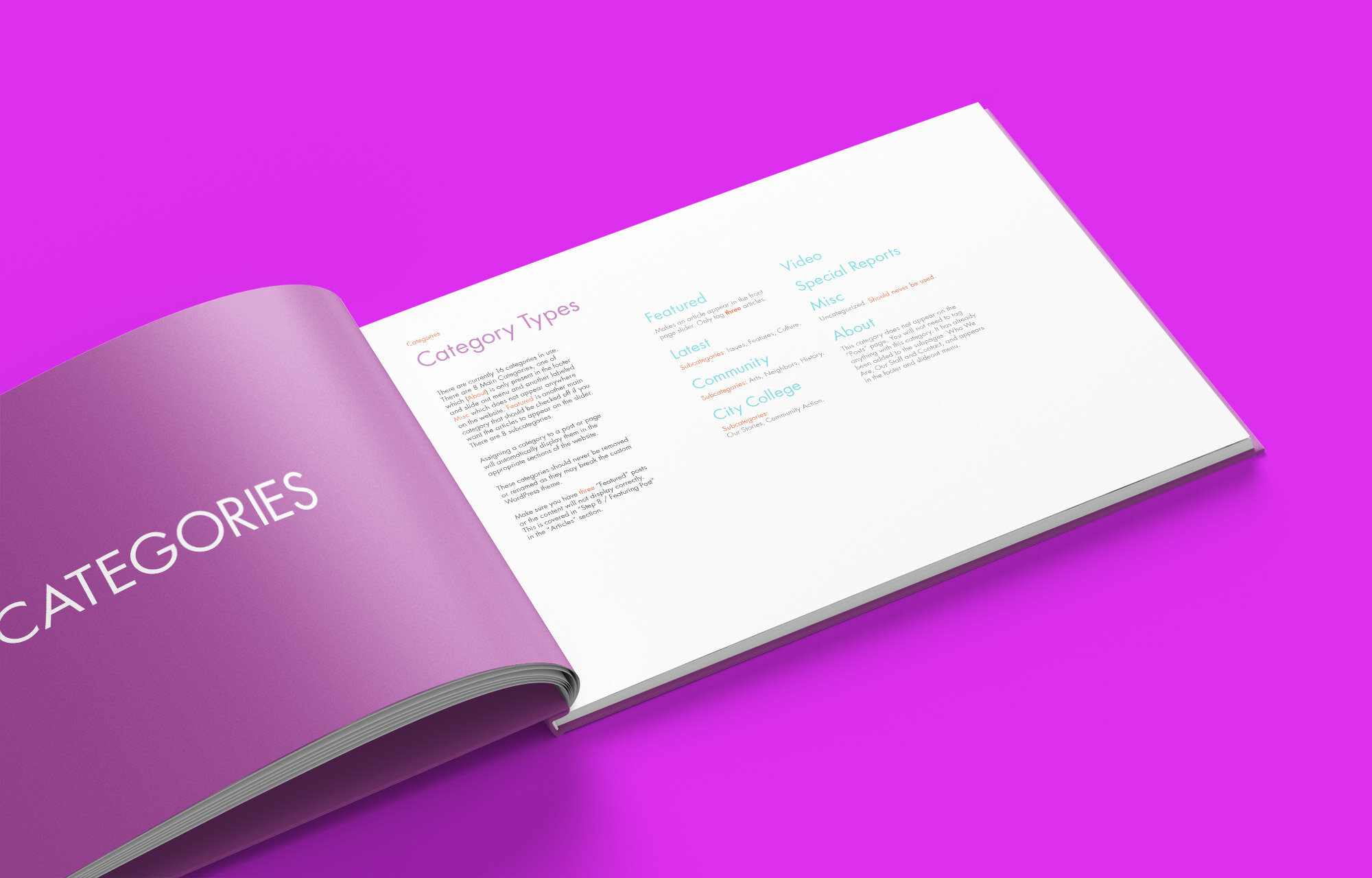
To ensure a smooth handoff, we created a detailed guide for Harlem View’s team covering how to use the Gutenberg WordPress editor. The manual walks through editing and publishing content, managing categories and series, applying color templates, adding media, and maintaining consistent image sizing — all tailored to the site’s custom setup.


Color Palette
We created an urban palette that reflected the multicultural and colorful area of Harlem. The moodboard images that inspired the color selections were mostly from or of the Harlem [and some Brooklyn] neighborhood(s) and artists.
Color Palette Moodboard
-

Yellow
CMYK 5 0 93 0
RGB 254 247 0
HEX #FEF700
-

Acid Yellow
CMYK 21 0 98 0
RGB 214 240 31
HEX #D6F01F
-

Acid Green
CMYK 0 34 0 100
RGB 179 239 34
HEX #B3EF22
-

Cyan
CMYK 58 0 17 0
RGB 2 231 235
HEX #02E7EB
-

Blue Green
CMYK 73 0 35 0
RGB 10 186 181
HEX #0ABAB5
-

Blue
CMYK 82 71 0 0
RGB 38 71 255
HEX #2647FF
-

Magenta
CMYK 37 80 0 0
RGB 212 57 229
HEX #D439E5
-

Red
CMYK 4 94 99 0
RGB 229 51 36
HEX #E53324
-

Orange
CMYK 0 39 100 0
RGB 255 169 4
HEX #FFA904
-

Heritage Blue
CMYK 100 45 0 60
RGB 0 56 101
HEX #003865
-

Heritage Purple
CMYK 68 100 38 45
RGB 73 11 67
HEX #490B43
Design Closeup
We used the colors from the color palette in a variety of ways to make the website, fun, urban and fresh. On category pages, a masked HV logomark overlays article images — reinforcing the Harlem View identity and adding visual breaks to improve long-scroll readability.
Color changing headlines for Series, Categories and Mission / About pages
Series boxes for the homepage
Featured articles on category pages change color on hover
Article breaks for long scroll article list using the HV logo as a mask
Sans serif fonts were used to provide a clean aesthetic with high legibility at all sizes. Alegreya Sans was used to portray the contemporary and urban nature of Harlem. A serif was used to provide contrast and to place emphasis on specific features, such as the series box on the homepage.
We used a mix of Rubik and Merriweather to create a clear visual hierarchy and add personality across different content types. Rubik appears throughout the site in three weights for body text, captions, subheads, and the article feed. Merriweather adds contrast in the homepage slider and Series modules.
Article Page - Subhead 1
Article Page - Subhead 2
Article Page - Subhead 3
Article Page - Subhead 4
Article Page - Subhead 5
An example of subheads in a larger article. The article above is “Making People Laugh … Even in a Pandemic” by Nicole Pardo.


